[en]
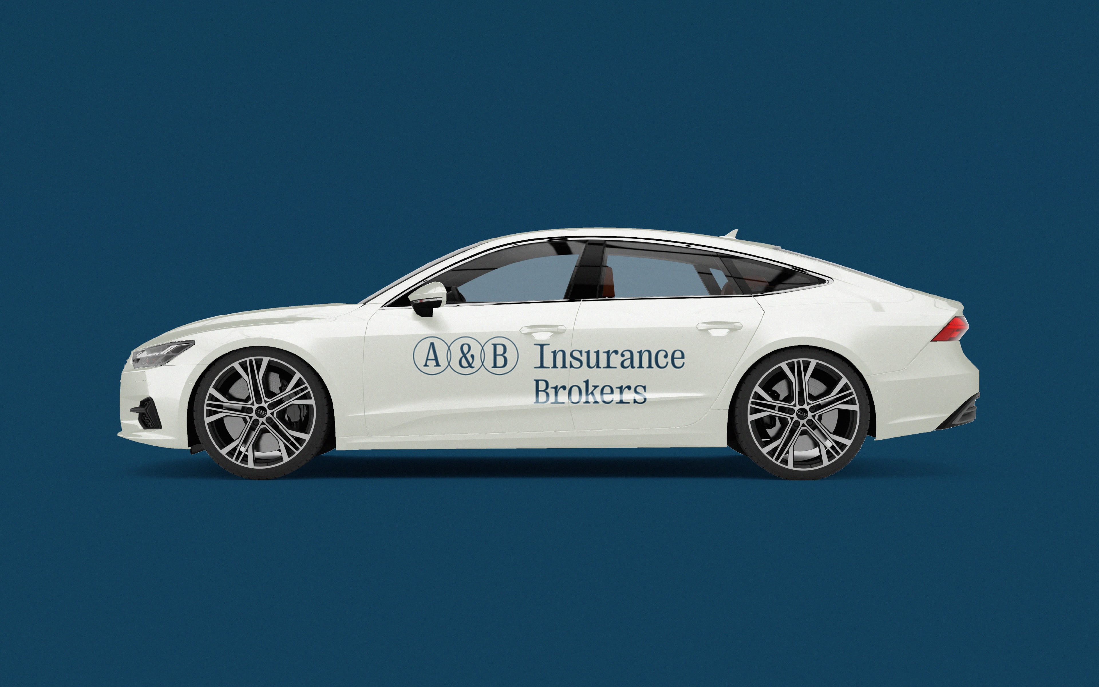
A & B Insurance Brokers
The Company
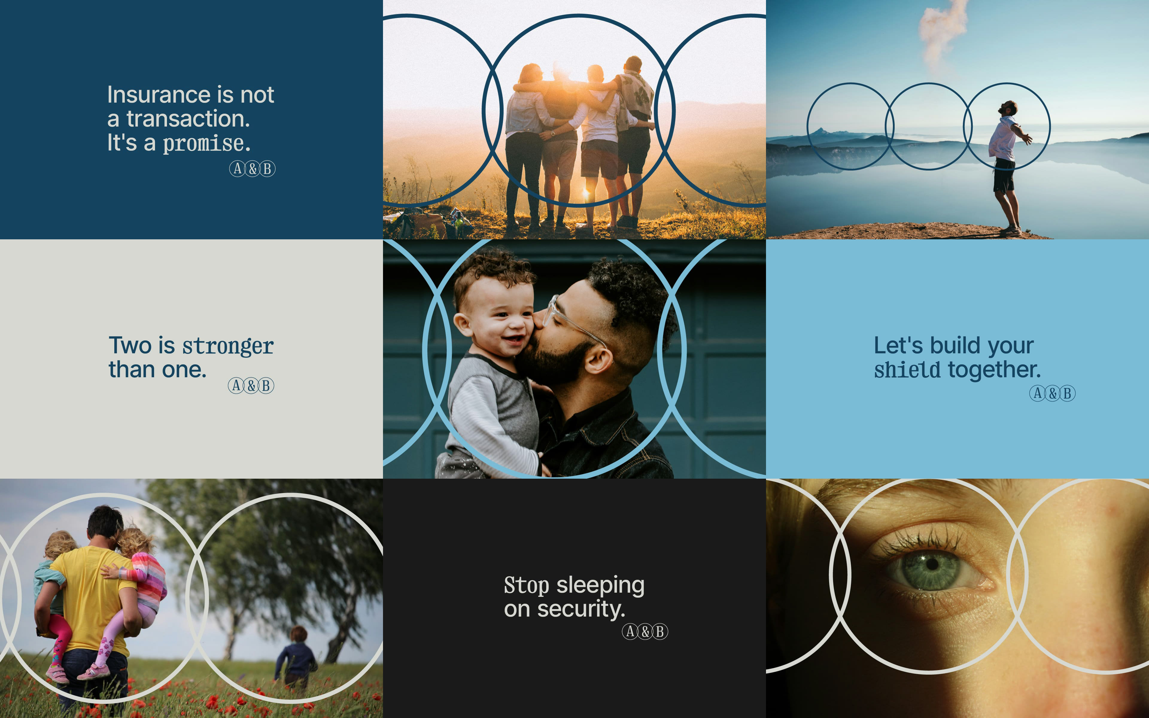
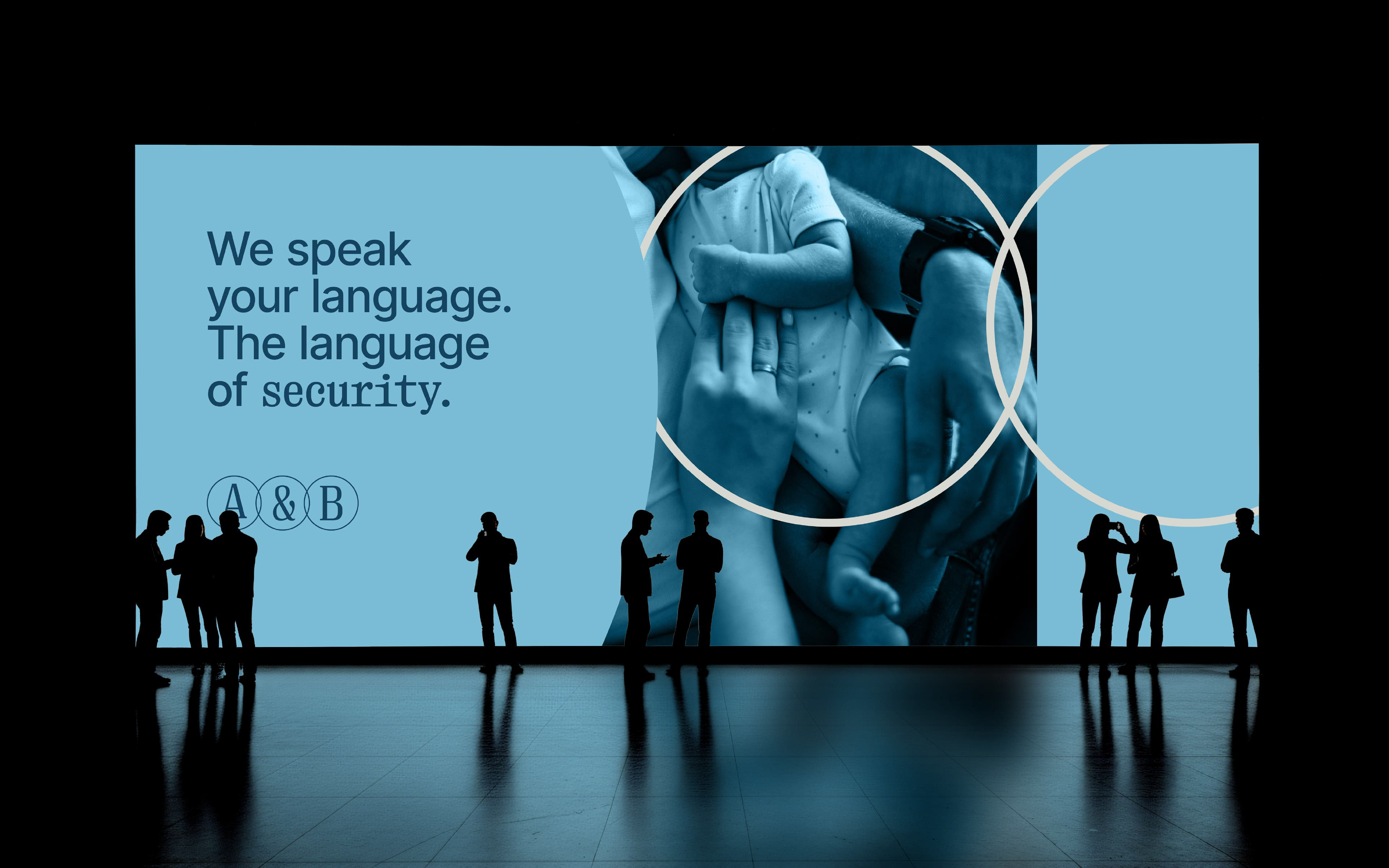
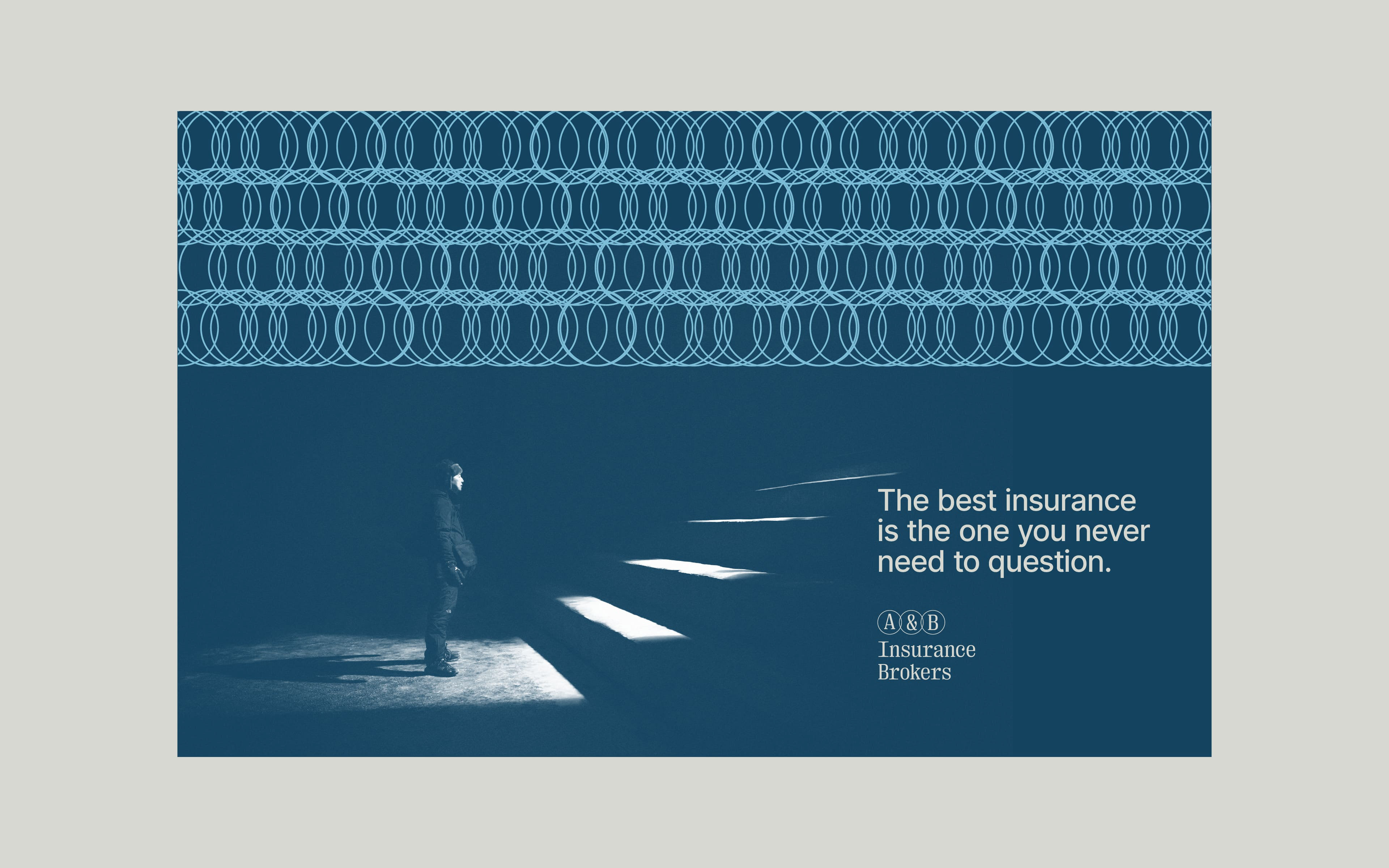
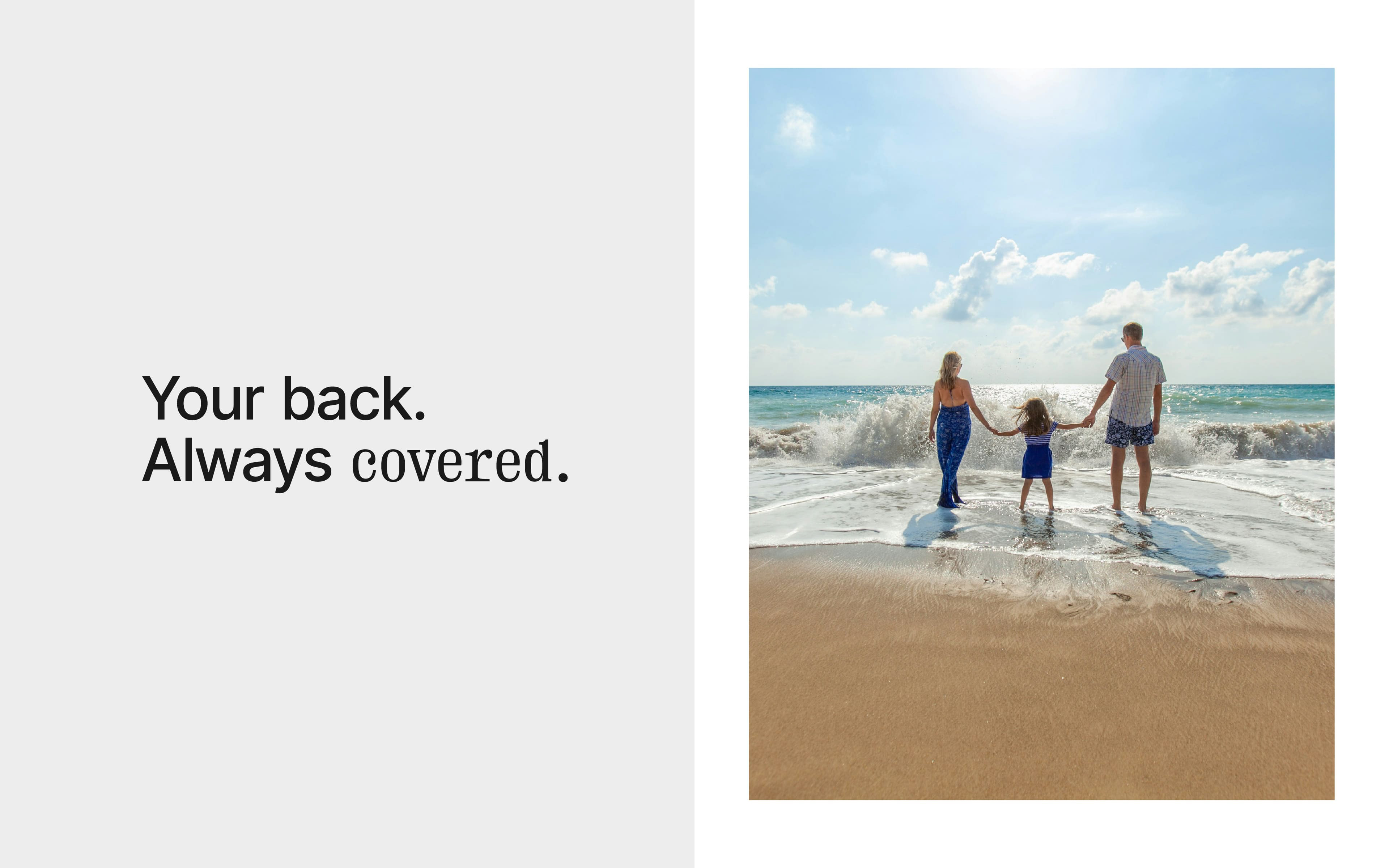
Insurance is not a transaction. It is an agreement between two sides looking in the same direction.
Between a broker who listens and a client who trusts.
We don't sell insurance, we protect dreams. And the power of protection lies in connection.
In the point where two forces meet. There, true insurance begins.
The Design Philosophy
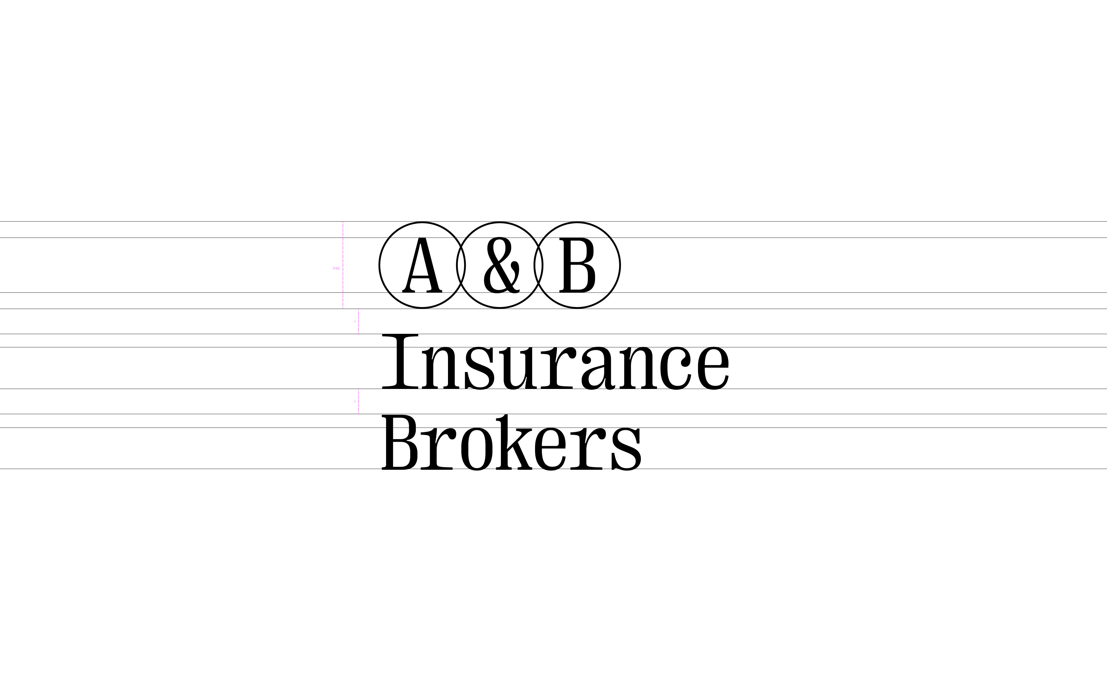
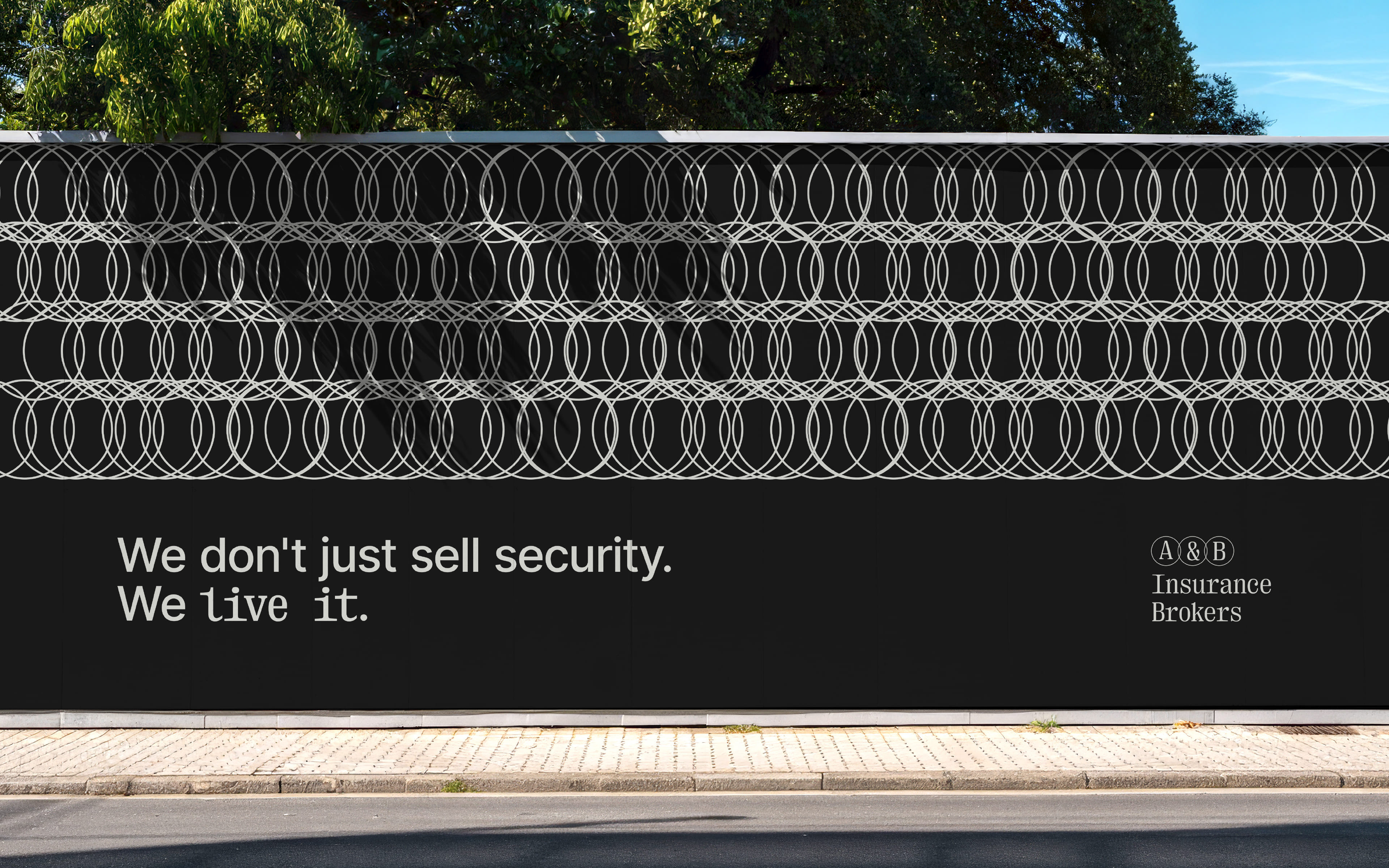
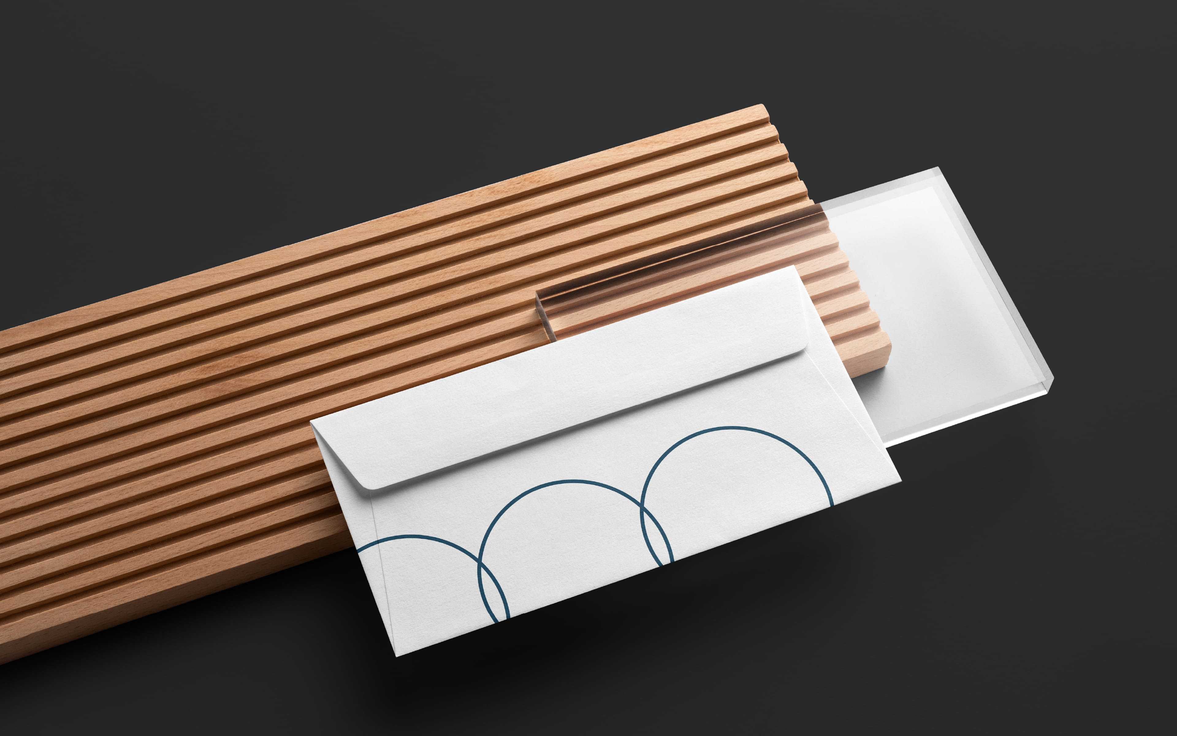
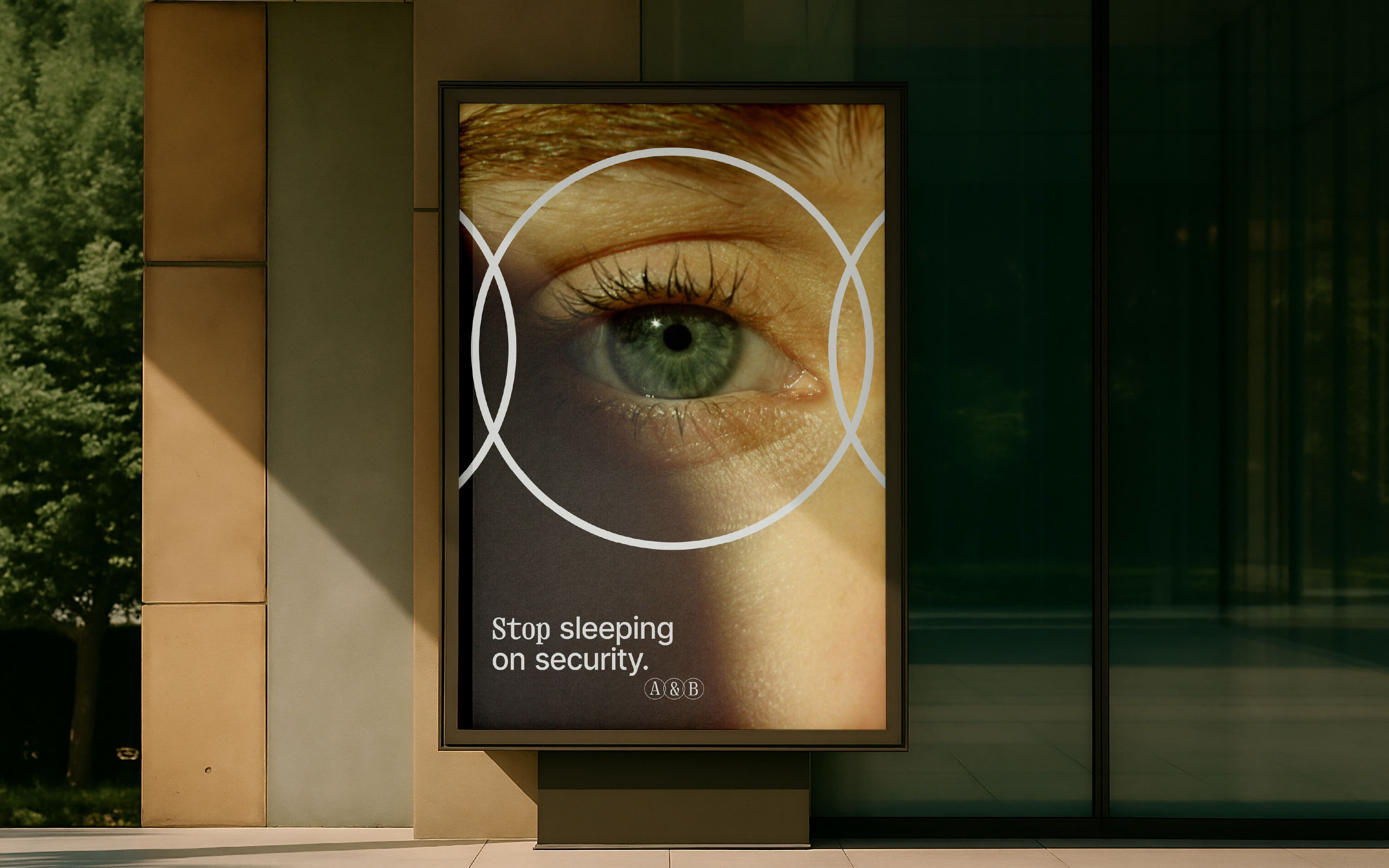
The A&B logo is not merely a symbol, it is a statement. Three overlapping circles, two letters, and between them the & the symbol of connection. Each circle is strong on its own, but at the point where they meet, something stronger is born.
This is the essence of the company in form. Two forces that don't compete for space they collaborate.
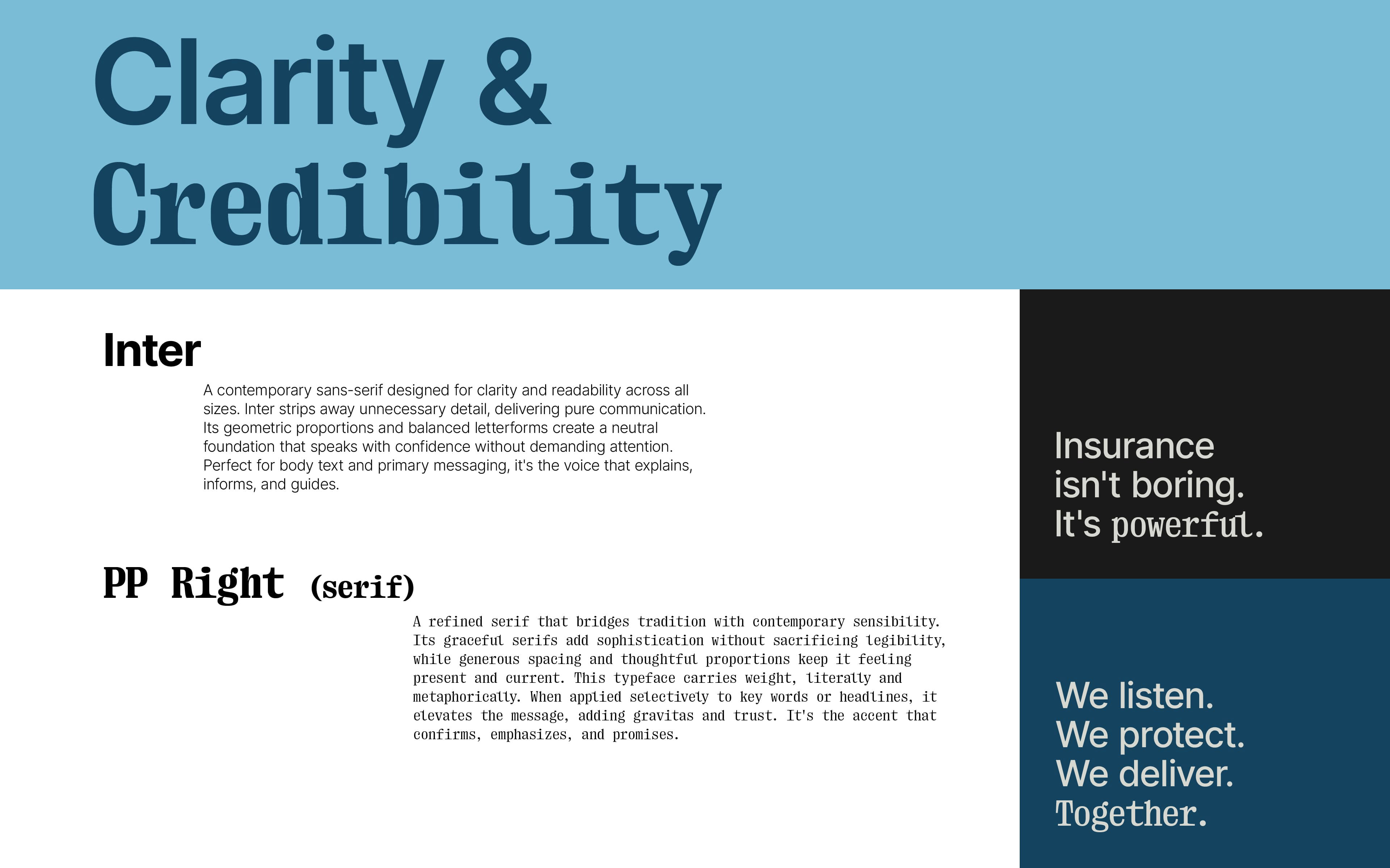
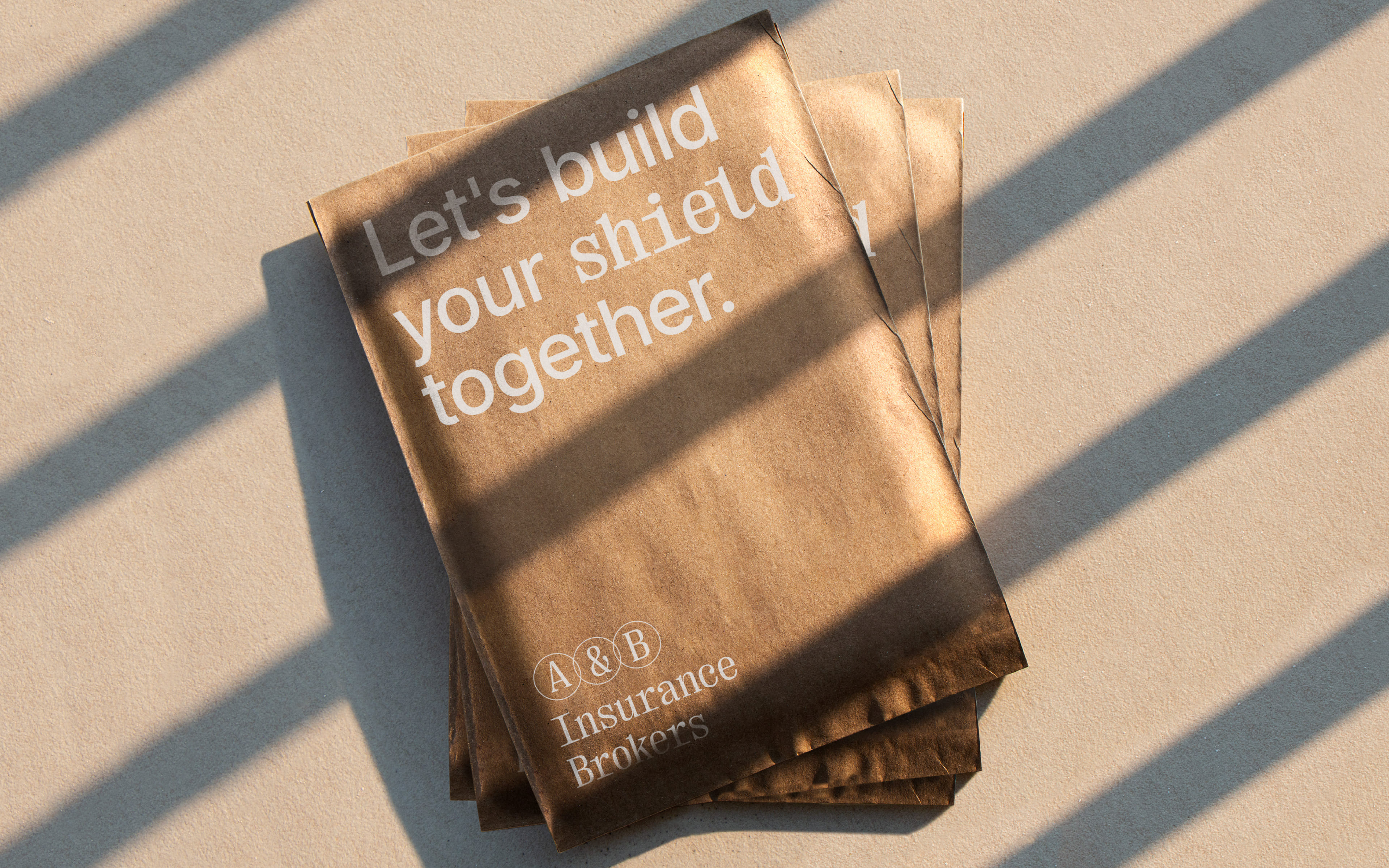
The typography, the deep blue color, the space we leave around each element all of this composes a message. It is not the blue of technology or speed.
It is the blue of stability, of seriousness, of calm.
It is the blue of stability, of seriousness, of calm.
The serif typeface doesn't shout, it speaks with certainty. The white space is not emptiness it is breath. Every choice we make tells the same thing: here there is no competition, there is collaboration. Here you can trust that every detail was thought for you.
[gr]
Η Εταιρεία
Η ασφάλιση δεν είναι συναλλαγή. Είναι συμφωνία ανάμεσα σε δύο πλευρές που κοιτάνε την ίδια κατεύθυνση. Ανάμεσα σε έναν ειδικό στις ασφάλειες που ακούει και σε έναν πελάτη που εμπιστεύεται. Δεν πουλάμε ασφάλειες, προστατεύουμε τα όνειρα.
Και η δύναμη της προστασίας είναι στη σύνδεση. Στο σημείο που ενώνονται δύο δυνάμεις. Εκεί που αρχίζει η αληθινή ασφάλιση.
Η Σχεδιαστική Φιλοσοφία
Το λογότυπο της A&B δεν είναι απλώς ένα σύμβολο, είναι μια δήλωση. Τρεις κύκλοι που επικαλύπτονται, δύο γράμματα και ανάμεσά τους το & το σύμβολο της σύνδεσης. Κάθε κύκλος είναι ισχυρός μόνος του, αλλά στο σημείο που συναντώνται, γεννάται κάτι ισχυρότερο. Αυτή είναι η ουσία της εταιρείας σε μορφή. Δύο δυνάμεις που δεν μάχονται για χώρο, συνεργάζονται. Η τυπογραφία, ο βαθύς μπλε χρωματισμός, ο χώρος που αφήνουμε γύρω από κάθε στοιχείο όλα συνθέτουν ένα μήνυμα. Δεν είναι το μπλε της τεχνολογίας ή της ταχύτητας. Είναι το μπλε της σταθερότητας, της σοβαρότητας, της ηρεμίας.
Η serif γραμματοσειρά δεν φωνάζει, μιλάει με βεβαιότητα. Ο λευκός χώρος δεν είναι κενό, είναι αναπνοή. Κάθε επιλογή μας, λέει το ίδιο πράγμα: εδώ δεν υπάρχει ανταγωνισμός, υπάρχει συνεργασία. Εδώ μπορείς να εμπιστευθείς ότι κάθε λεπτομέρεια έχει μελετηθεί για σένα.